La Catrina Brewing Co. is a fictional brewery.
The game "La Lotería" has been played throughout Mexico since Colonial times. Similar in concept to American Bingo, it is played using 54 widely varied characters and symbols of Mexican culture (like the skull, the moon, the mermaid and the rooster), which just happens to inspire this packaging.
What began as a collaboration between a beer lover and an entrepreneur, La Catrina Brewing Company has taken over the market with its unique take on familiar flavors. Harvesting the flavor of spices, the makers created a new concoction with a mighty kick of flavor. With the cultural touchstone of "La Lotería", a popular Mexican bingo card game, at its core, this brewery brings each character to life. Adorned with typical Mexican craftsmanship and style, the packaging exudes elegance, richness, and lots of fun. I created an entire brand from logo marks, illustration, to packaging that would showcase a modern take on the popular bingo card game.
Project Components: Logo design, bottle designs, packaging, and coasters
SKETCHES

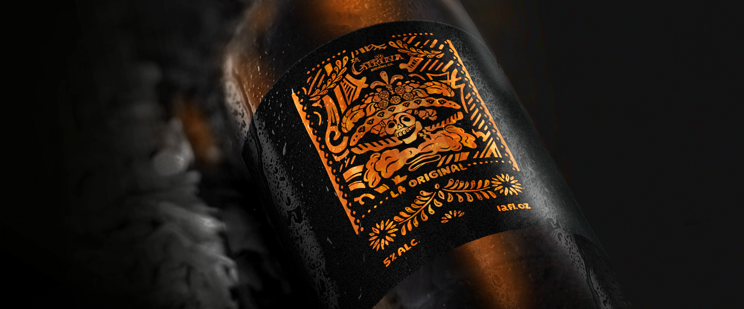
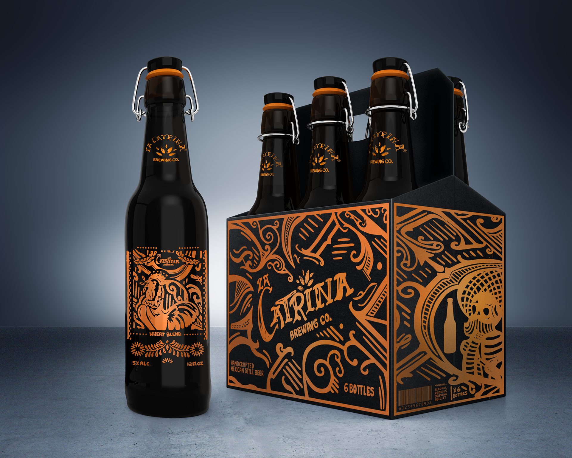
The bottle packaging was inspired by the illustration "La Calavera Garbancera" by Mexican artist Jose Guadalupe Posada. His skeleton illustrations, or calaveras, are widely used during the Day of the Dead celebrations. 

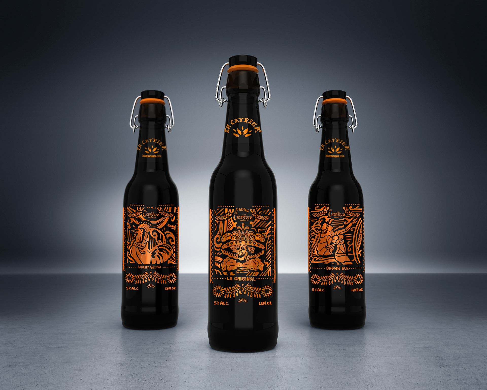
Three of the characters from the "Loteria" were taken and deconstructed to form the main flavors for La Catrina Brewing Co. The rooster, la catrina (a play on the character "El Catrin"), and the mermaid were chose, 

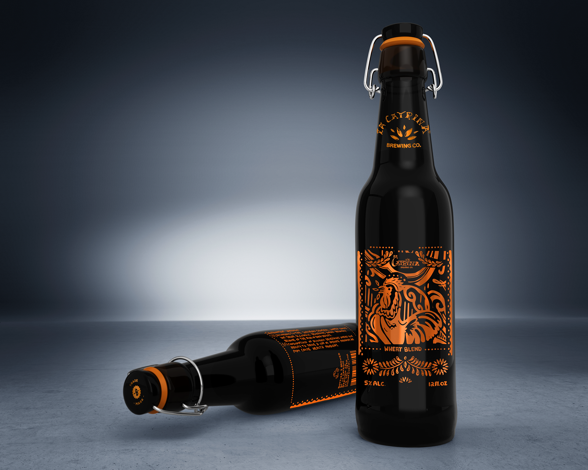
The rooster, a character in La Loteria, is one of the most unique design as it serves as the "Ace" of the bingo set. I wanted this illustration to have a diagonal design that evoked sound. Borrowing elements form the harp, these designs embrace the rooster and its sound.

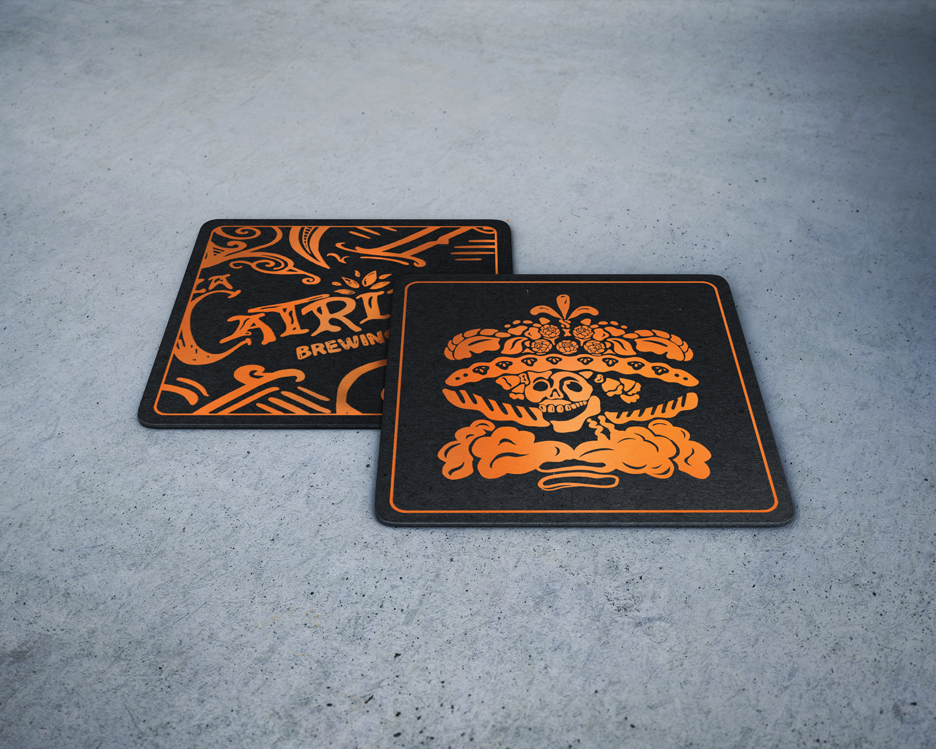
Coaster design made for the brewery as promotional materials. 

The packaging design covers the carrying case, 3 bottle designs, and two coaster designs.
Back to Top